


Introduction
The pharma industry is investing more and more in data science for various purposes including targeting more effectively and discovering better investment opportunity. One of the more recent application of data science in the industry is Social Network Analysis based on health claims data. The hypothesis is that social networks can be analytically derived based off observations of interactions between physicians. Social ties between physicians can be formed from patient referrals, participating in a seminar, or doing joint research. If we consider each physician a "node" and each interaction an "edge" then we have a network (or graph) of physicians. Algorithms can be applied to the network to rank physicians based on the individual’s influence on the network. For pharma companies, this analysis provides sales representatives an advantage to target the physician with the most influence and improve the allocation of marketing resources.
Exploring the datasets
I used two primary data sources and one reference data source for this project:
- Referral Data: This data provides shared patient data from cms.gov. The data consists of the number of encounters a single beneficiary has had across healthcare providers at intervals of 30 days in the year 2015. This dataset has five features and holds 35 million records. In order to protect the identity of patients, the dataset excludes any sharing that occurred with less than 11 patients over the course of the year. (The file name is "physician-shared-patient-patterns-2015-days30.txt")
- NPI Data: The NPI data from cms.gov contains personal and professional information about healthcare providers. This dataset has 5.4 million records and 270 features. (The file name is " npidata_20050523-20171112.csv")
- Taxonomy Data: In the "NPI data" the taxonomy appears in the form of a taxonomy code and there is no human-readable description provided. The dataset provided by National Uniform Claim Committee were used to add taxonomy titles to the visualization.
Exploring Referral Data
One of the most important steps in a data science project, which can often be overlooked, is to explore the data to become familiar with the nuance of the dataset. In order to make sure to not omit this important step, let us take a look at the referral dataset. Personally, I am a fan of visualizing data but for this particular dataset I faced some issues interpreting the results:
# 'referrals' dataframe holds the content of 'physician-shared-patient-patterns-2015-days30.txt'

# counting the number of times each NPI appears
referral_group_box = referrals.groupby(["from"]).size().reset_index(name='count')

# counting the number of times each Count appears
referral_group = referral_group_box.groupby(["count"]).size().reset_index(name='total_count')

# sorting based on the counts
referral_group = referral_group.sort_values(["total_count","count"], ascending=[0,1])

#plotting the distribution
fig, ax = plt.subplots(figsize=(15,12))
plt.title('Referrer Distribution - 2015')
ax = sns.barplot(data=referal_group, y="total_count", x="count")
ax.set(ylabel='Number of Healthcare Providers', xlabel='Referral count')
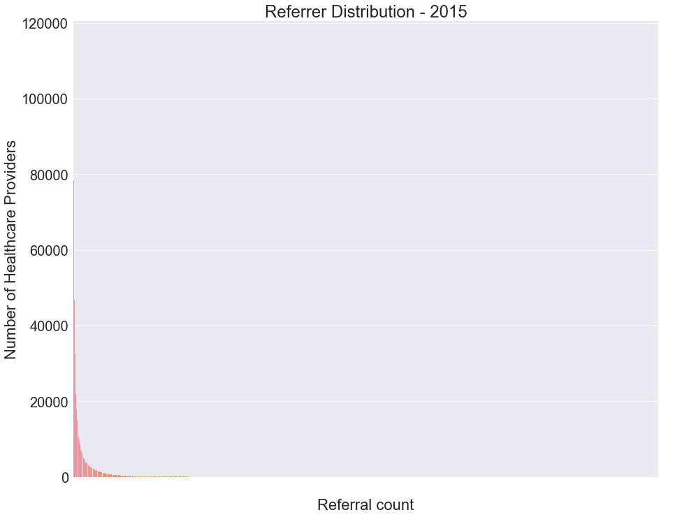
As you can see, the high variance in the data makes it difficult to comprehend much meaning. There is an exponential distribution which shows that most of the health care providers referred to only one other healthcare provider.
# plotting the boxplot
fig, ax = plt.subplots(figsize=(15,12))
ax = sns.boxplot(referal_group_box["count"])
ax.set(xlabel='Referral Count')
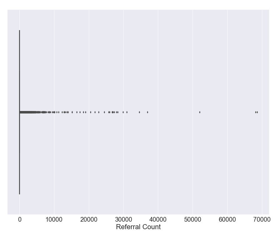
It is difficult to tell what it is at first glance but it is actually a box plot which is unreadable due to high variance. Interestingly, the old school table of the summary can provide more data in a readable form.
referral_group_box["count"].describe()

count    920364.000000
mean         37.872951
std         203.976611
min           1.000000
25%           3.000000
50%          10.000000
75%          35.000000
max       68696.000000
Name: count, dtype: float64
The summary demonstrates why the plots look so scrambled. The standard deviation is higher than the mean, so we are dealing with a dataset with high variance. We know that there are two types of healthcare providers in this dataset: organizations and individuals. Let us see if the distribution changes if we remove organizations.
count    680307.000000
mean         32.112346
std          57.368288
min           1.000000
25%           3.000000
50%          11.000000
75%          36.000000
max        2779.000000
Name: count, dtype: float64
Surprisingly, 76% of healthcare providers are individuals. However, even by removing the organizations from the network, the high variance remains.
Exploring the NPI dataset
NPI dataset has 5.6 million records and 272 features but I am only interested in the following:
- "NPI"
- "Provider Organization Name (Legal Business Name)": Empty if the healthcare provider is an individual
- "Provider First Name"
- "Provider Last Name (Legal Name)"
- "Provider Business Practice Location Address State Name"
- "Healthcare Provider Taxonomy Code_1"
Fortunately, all the features, except the "Provider Organization Name", have a filling rate more than 99% so no imputation is necessary.
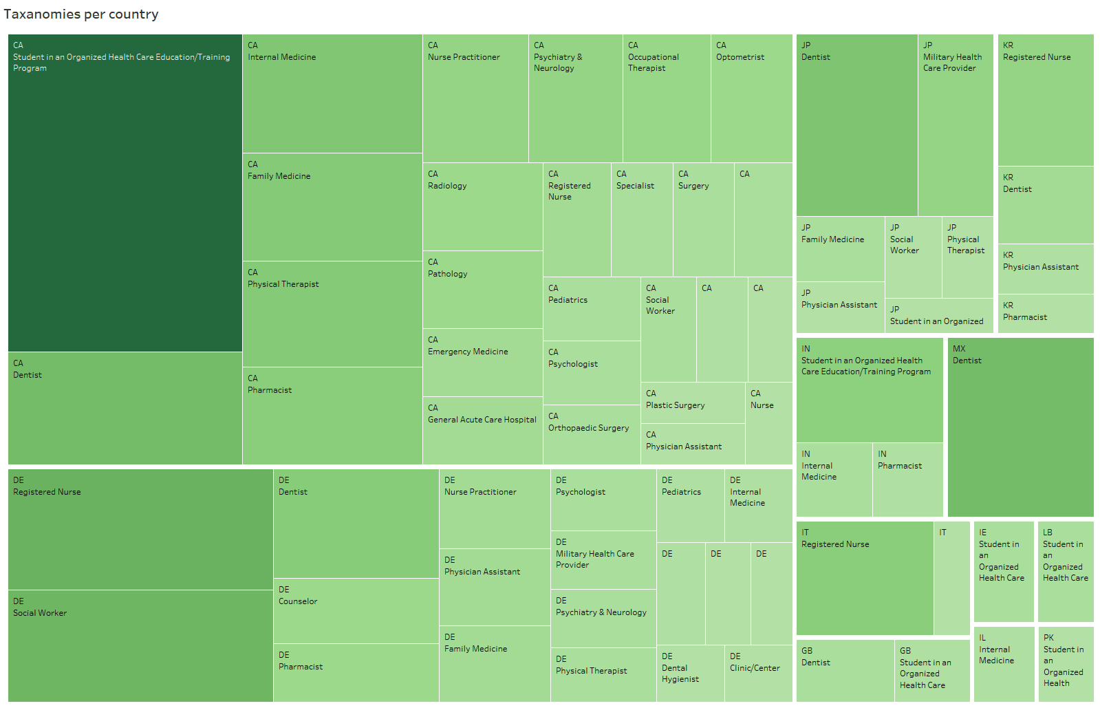
Interestingly the NPI dataset contains 119652 non-US healthcare providers from 135 counties. The following treemap, illustrated using Tableau, shows top 12 countries along with the taxonomies. Canada has the most amount followed by Germany and Japan::
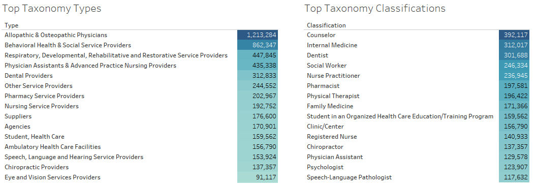
Regarding the taxonomy, each taxonomy type has some taxonomy classification. The NPI dataset has 29 distinct taxonomy type and 235 classifications. Here are the top taxonomies by type and classification with the number of corresponding records in the NPI dataset:
Ranking Healthcare Providers
Now that we know how the data looks, it is time to apply PageRank. However, it is a good idea to briefly discuss what PageRank is.
What is PageRank?
PageRank was invented by the founders of Google and is used by Google Search engine to rank web pages in the web search engine results. PageRank is valuable for when people search online. According to Google, 32% of clicks go to the very first result. PageRank is important and the idea is simple; The web consists of webpages which can contain links that point to other webpages, creating a large directed graph. Some pages are more in the center of attention because many other pages link to them. PageRank is an iterative algorithm that ranks each webpage (node) by considering the number and influence of inbound links. Influence of the link depends on the rank and number of outbound links of the source webpage. Let's look at an example:

Node B has the highest rank because it has the most inbound links but why does C, with only one inbound link, stand in seconds place? The answer lies in the fact that B only points to C. Since B is important, it shows that C is also important. On the other hand, D could not give A so much reputation because D itself does not have a high score. Take a look at E, it has 6 inbound links but there is a big gap between the score of E and B, again, because the inbound links are not from high-rank nodes and nodes also the source nodes have more that one outbound links.
Please note that PageRank is an iterative process in the sense that applying page rank only once does not produce a useful result. We need to initialize the nodes with the same score, usually "1", then apply ranking algorithm until scores stabilize which is also described as "until network converges".
Back to physician network
After explaining the application of PageRank in web space, now we can talk about the utilization of this method to rank a network of physicians. Assuming each physician is a webpage and referrals as inbound and outbound links, we can use PageRank to rank healthcare provider based on the "influence" assuming that higher page rank means higher influence in the network.
One important difference that we need to address here is that each pair of webpages usually links to each other just once but two healthcare providers may refer a numerous of times each year. For this research, I decided to disregard the number of referrals between two nodes because I am interested in the healthcare providers with more connection rather than with more patients.
Implementation
I used Apache Spark and Scala language to run PageRank. For years, PageRank was being computed using MapReduce but processing gigabytes of data. The I/O-intensive MapReduce is only feasible if you have access to dozens of computers. Spark, on the other hand, builds the computation model and process the data in memory and uses the hard drive to write the final result. Consequently, according to Apache website, Spark is at least an order of magnitude faster at processing data than Hadoop, an open-source implementation of MapReduce.
To process the graph and calculate PageRank, I used Spark's API for graphs computation called GraphX. The current version of the GraphX includes a set of graph algorithms to simplify analytics tasks. I used the one that continues until convergence. (source)
# alpha is the random reset probability (typically 0.15)

var PR = Array.fill(n)( 1.0 )
val oldPR = Array.fill(n)( 0.0 )
while( max(abs(PR - oldPr)) > tol ) {
  swap(oldPR, PR)
  for( i <- 0 until n if abs(PR[i] - oldPR[i]) > tol ) {
    PR[i] = alpha + (1 - \alpha) * inNbrs[i].map(j => oldPR[j] / outDeg[j]).sum
  }
}
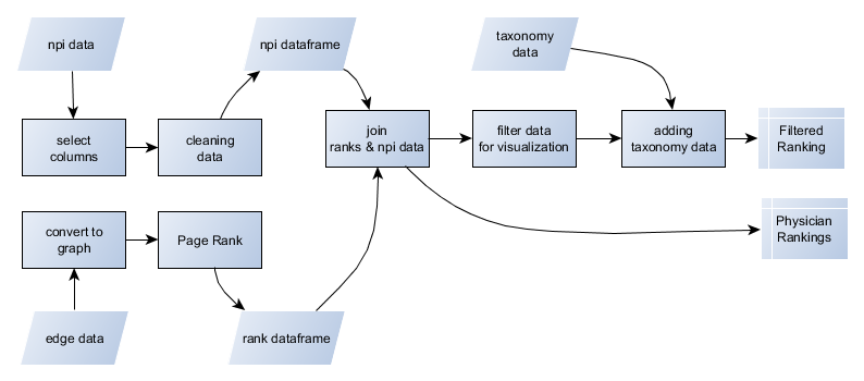
The following Scala code reads the data, cleans it, applies the PageRank, and finally saves the output to one file:
import org.apache.spark.graphx._
import org.apache.spark.rdd.RDD
import spark.implicits._
import org.apache.spark.sql.types.LongType

var output_dir = ""
var input_dir = ""
var npi_file = ""
var edge_file = ""

output_dir = "../output/"
input_dir = "../input/"
npi_file = input_dir+"npidata_20050523-20171112.csv"
edge_file = input_dir+"physician-shared-patient-patterns-2015-days30.txt"

// reading the shared patient data and cleaning it
var edges: RDD[Edge[String]] =
  sc.textFile(edge_file).map { line =>
    val fields = line.split(",")
    Edge(fields(0).toLong, fields(1).toLong)
}
// create graoh
val graph = Graph.fromEdges(edges, "defaultProperty")

// page ranks
val ranks = graph.pageRank(0.01).vertices

// loading the npi information
case class record(NPI: String, orgName: String, firstName: String, lastName: String, state: String)
var npiData_df = spark.read.option("header", "true").csv(npi_file);

//remove unnecessary columns, rename columns, change datatypes
var col_names = Seq("NPI","Provider Organization Name (Legal Business Name)","Provider First Name","Provider Last Name (Legal Name)","Provider Business Practice Location Address State Name","Provider Business Mailing Address Postal Code","Healthcare Provider Taxonomy Code_1")
npiData_df = npiData_df.select(col_names.map(c => col(c)): _*)
col_names = Seq("npi","business_name","first_name","last_name","state","postal_code","taxonomy_code")
npiData_df = npiData_df.toDF(col_names: _*)
npiData_df = npiData_df.na.fill("")
npiData_df = npiData_df.withColumn("title", concat($"business_name",lit(" "),$"first_name",lit(" "),$"last_name"))
npiData_df = npiData_df.withColumn("individual", when($"first_name".isNull or $"first_name" === "", 0).otherwise(1))
npiData_df = npiData_df.drop("business_name").drop("first_name").drop("last_name")
val final_npiData_df = npiData_df.withColumn("npi", 'npi.cast(LongType))

// join npi data with ranking
val ranksDF = ranks.toDF().withColumnRenamed("_1", "id").withColumnRenamed("_2","rank_raw")
var resultDf = final_npiData_df.join(ranksDF, final_npiData_df("npi") === ranksDF("id"),"right_outer").cache()
// normilize the ranks
var min_max = resultDf.agg(min("rank_raw"),max("rank_raw")).first
resultDf = resultDf.withColumn("rank", ($"rank_raw"-min_max.getDouble(0))/min_max.getDouble(1))

// save all data to one file
val ranks_count = resultDf.count()
resultDf.select("id","title","state","postal_code","taxonomy_code","rank").coalesce(1).write.option("header", "true").csv(output_dir+"ranks_csv");
The code speaks for itself, I just want to mention that we need to normalize the final ranks using min-max normalization method because this implementation of PageRank does not return normalized values.
An advantage of using Spark is the speed especially when you compare it with the runtime of Hadoop MapReduce. Even using a single 8-core computer with 32GB of RAM it took Spark two minutes to load, calculate, and save the result.
The Result
Now that we have the ranking for all healthcare providers in the US, some exploration is possible to see which taxonomy classifications and healthcare providers are the most influential. The result shows then on average, organizations score 73% higher than individuals. Thus, we need to analyze the results of each group separately to avoid ignoring important details in the individual group. The median PageRank scores of each taxonomy classification could be a useful metric to measure the influence of each taxonomy. The following table compares the top taxonomy classification among individual and organization health care providers.
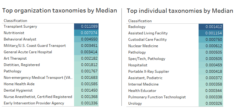
In the organization group "Transplant Surgery" is the most influential taxonomy with the score of 0.011. "Nutritionist" comes second with a considerable margin with the score of 0.007. The top results in the individual group are quite different as the "Pathology" is the only notable shared taxonomy among two groups. "Radiology" and "Assisted living facility" are the top results for the individual group with the close score of 0.0014 and 0.0011 respectively.
Another aspect of the result worth looking into is the dominant taxonomy for each state. Are "Transplant Surgery" and "Radiology" among the top results for each state? The following treemaps may answer the question:

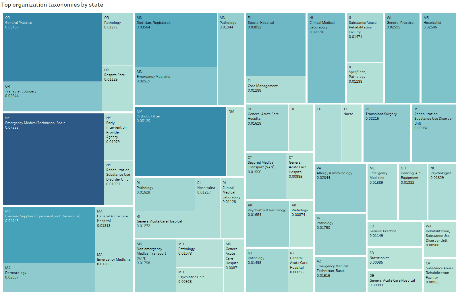
Interestingly, the high score for the organization taxonomies vary. There are few states, such as Oregon and Vermont, which have "Transplant Surgery" as the top result. On the other hand, "Radiology" is consistently the dominant result for individuals.
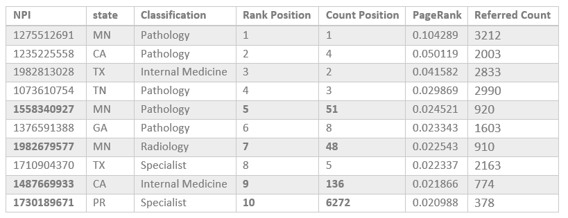
As I mentioned before, another aspect of the results is healthcare influence. Generally, we assume that nodes with more inbound links would get a higher rank by the PageRank algorithm. To test my assumption, I listed the healthcare providers that inferred the most in the following table:

It is interesting to see four out of five most referred organizations belong to "LABORATORY CORPORATION OF AMERICA HOLDINGS". According to this table, there is a strong correlation between rank given by PageRank and the inbound links. The next table shows the ranking of individuals:
Rank of individuals follows a different pattern as physicians with NPI numbers of 1558340927, 1982679577, 1487669933, and 1730189671 have a "Count Position" much higher than their "Rank Position". One possible explanation could be these nodes have at least one inbound link from a high-rank node. For instance, I checked the node with NPI of 1730189671, it receives an inbound link from "SPECTRA EAST, INC." which has a high rank of 0.19201.
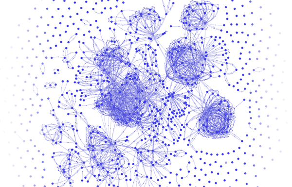
Demo
For now, only plots and tables are used due to the high number of nodes and connections. Even if I could illustrate all the connection, the result would be a hairball graph. One solution to the large data issue is to randomly sample the dataset. However, by considering the 5.4 million nodes, only around 0.0001 should be selected which would result in a very sparse graph. So I ended up choosing 0.25% of the least populated state, Vermont, as the sample dataset to demonstrate using vis.js. This Javascript library is a great tool to demonstrate a graph and it works smoothly working with a couple of hundred node.